
It’s almost 2020, which means if your website looks more like a boring textbook than it does a modern, aesthetically-pleasing window into your business, you’re going to get left in the dust. Your website is live and functional all hours of the day and night, no matter what your business’s operating hours are, and therefore serves as an around-the-clock salesperson for your company. It’s the centerpiece of your marketing efforts, so simply put, if your website is unattractive and difficult to navigate, people won’t have the patience for you.
So, how do you make your website more attractive and easier to navigate? You’re not going to completely transform your site overnight, so it’s best to take the process one step at a time and give all the different areas of your site your full attention so that you don’t cut any corners. Let’s walk through the different aspects of your site that you can update to ensure more people are coming, and staying on your site.
Elements of Good User Experience
When people come to your website, you want them to have an experience that is as meaningful and valuable as possible. Usability.gov outlines seven critical factors of user experience that can make or break your chances of converting your website visitors:
- Value — Does your content, products and/or services have a purpose on your site?
- Usability — Is your website difficult or easy to use?
- Usefulness — Is your content original and does it answer people’s questions?
- Desirable — Does your brand provoke emotion or appreciation?
- Findable — Is your content easy to find and navigate?
- Accessible — Can people with disabilities find your website?
- Credible — Does your brand create trust with what you display on your site?
Now, let’s get into the details. Here are some tried and true tactics for improving the user experience on your site and increasing the likelihood of converting visitors into customers.
1. Use white space
White space on your site is your friend because it can make your website feel open, fresh and modern. You know those stores at the mall that are filled with messy clothing racks and unorganized shelves? You probably avoid them most of the time. You don’t want your website to be the same - cluttered and drive people to turn back the second they walk through your digital door.
In a study conducted by CrazyEgg, they found that white space around text and titles increases website users’ attention by 20%. Not only does white space make your content more legible, but it also allows your users to focus on the elements surrounding the text, like awesome graphics and calls to action.
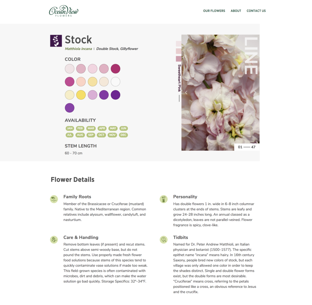
Ocean View Flowers, a California flower farmer company, does a great job of utilizing white space. Check out the snapshot below taken from one of their flower pages. There is no unnecessary information cluttering the page, and the amount of white space on the page allows the elements on the page to stand out.
One thing to keep in mind is that a lot of users will never scroll down below the fold, so make sure that your most important information is located above the fold so that you don’t miss out on conveying the message you want people to see the most.
2. Optimize your page speed
One of the most common and frustrating experiences users have when interacting with websites is waiting too long for a page to load. In today’s fast-paced world with people having the ability to access the internet from anywhere and on a wide range of devices, they expect to find what they need quickly.
According to a study done by Section.io, if people have to wait an extra five seconds for a website page to load, the bounce rate goes up by more than 20%. So, how do you make sure that your pages are loading quickly and not driving users away? There are a couple of things you can do.
- Start with your images. Images are one of the main factors that slow down page speed, so work to reduce the file size of all your images before uploading them to your site. Sites like compressor.io can help you compress your images and drastically speed up your web pages.
- Use Google PageSpeed Insights to score your website for mobile and desktop speed. Google will provide further recommendations on what you can do to improve.
- Simply get rid of any unnecessary assets and features that slow down your site speed and interrupts the user experience.
3. Use effective calls to action
When people are viewing a website page, they automatically jump to the parts of the page that are the most important to them. You can help guide people visually where you want them to go with calls to action (CTAs).
CTAs that include a different color button and action words allow your website users to better navigate your site and help them find what they’re looking for faster. Make sure to choose your CTA colors wisely, as different colors provoke different meanings to users. The words in your CTA should motivate your readers to do something, so make them stand out and convey the right message.
On every page of their site, HubSpot has clearly defined and effective CTAs that provide the reader value and motivate them to take action, like the example below.

4. Make sure your links look like links
Just like calls to action, links visually give off the message “click me”. Make sure the links on your site are easily identifiable by visual cues. Underlined and different colored text are best practices that draw the reader’s eyes to the link to click on it. Most people associate blue underlined text with a link, so don’t feel the need to do anything out of the ordinary here (unless you really want to).
When hyperlinking, take into consideration the length and amount of hyperlinks you have on the page. Typically, the longer the link title, the easier to identify it is. However, too many hyperlinks on a page can be distracting and overwhelming.
5. Make the body of your content easier to digest
If people land on your website and your service pages or blogs look like they were taken straight out of a law school textbook, you’re going to send readers away faster than they arrived. It’s critical to make the body of your content easier to digest for readers - and that means keeping paragraphs short and leveraging images and bullet points when necessary.
A good chunk of the people that look at your web pages will most likely scan the content, not actually read it. Make this easier on them by having shorter paragraphs with 2-4 sentences or phrases in each.
Bullet points are excellent to use for scanners as well because you can still communicate important information in a quick and concise way, like benefits, ways to solve their problem, product/service features, etc. This makes the text more attractive to readers, helps break up the page, and adds more white space.
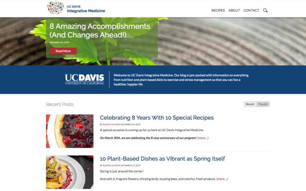
Be sure to make use of images and icons throughout the page to give people a break from reading and add more life and color to your page. No one wants to scroll through a massive block of black text on a white background. Yikes. Here is another example from UC Davis Integrative Medicine. Their site does a great job of leveraging CTAs, headings, images, and short snippets of text in order to make the page aesthetically pleasing and easy to navigate.
6. Avoid stock photography when you can
With the endless amount of websites and content that crowd the web, people can tell when you use stock photography that they recognize from other sites. Using stock photography on blog posts is okay, but when it comes to your core website pages, original photography provides so much more substance and credibility to your brand.
The truth is, people are getting more judgemental about businesses just based off of their websites alone, so no stock photography will do your products, services, mission, and core values justice. Use creative, original images strategically and place them on your website to support your content and effectively convey your message to your target audience.
7. Use videos to engage your audience
Videos can be an even more engaging medium to reach your audience. Studies show that people will usually click on a video on a web page if they are interested in learning more. If you are in a business that relies heavily on that personal touch or making relationships, then video may be another great way of making that connection to your potential customer.
Below, you can see how the California Rice Commission uses video as a tool to better explain how the various rice fields and farmers across California work together to produce rice for the entire nation. This video, as opposed to a large block of text, provides a user-friendly and effective way to convey their message.

8. Headings are your friend
Like we mentioned before, a lot of people who come to your website will simply scan the content instead of read it thoroughly. Headings make this easier on people by guiding them through the page to help them find what they’re looking for. There are usually 3-4 levels of headings:
- Title (H1)
- Headings (H2)
- Sub-headings (H3)
- Paragraph/body text
It’s also critical to include keywords in your headings so that search engines can easily rank your site. Search engines typically give headings a higher priority over other content, so choosing the right heading is important to effectively convey your message to readers while giving your site better searchability. Find the perfect balance between an SEO-friendly heading and one that makes it easy for your readers to scan your content and find what speaks to them directly.
9. Keep your website consistent
Just like your brand logo that you keep consistent everywhere someone sees your company name, the pages on your website need to be consistent, too. You don’t want readers to hop from page to page on your site and forget where they are. Consistency means that everything needs to match, including:
- Heading sizes and fonts
- Text sizes and fonts
- Coloring
- CTA button styles and colors
- Spacing
- Design elements
- Illustration styles
- Photo choices
You want people to have the same high-quality experience no matter what page they’re on.
10. Win back your 404s
Just like how waiting for a website page to load is annoying, so is clicking a link or image that takes the reader to a 404 (not found) page. Search engines don’t typically punish you for a 404 page, but that one error might be enough to send a website visitor elsewhere for a faster solution.
To check if you have any 404s, get your website set up with Google Webmaster Tools, where you can check crawl errors. If you can, try to redirect those missing URLs to the correct pages. You can also make sure that when a website visitor lands on a 404 page, you give them options to find what they may be looking for. These fixes will help keep visitors engaged with your content and help prevent losing the user completely.
11. Be mobile-friendly
It’s no secret that the rise of mobile search has sky-rocketed over the past several years. To put it simply, if your website isn’t mobile-friendly, you’re doing it wrong. In recent years, Google has even started to penalize websites that aren’t optimized for mobile devices, since people need to be able to access information from any type of device.
Check your website on your mobile phone. Is your design broken? Do you have to pan and zoom to read parts of the site? Is it difficult to find the information that is important to your visitors? If the answer to any of these questions is “Yes”, it will be worth your time and effort to fix these issues on your website.
Start creating a better user experience today
When you make adjustments to your site to improve the user experience, you are creating a more desirable and pleasant landscape for potential customers to connect with your brand. You reduce the friction that may interrupt your visitors from doing what you want them to do on your site. We know that the steps outlined above are no small task, and improved user experience doesn’t happen overnight. If you would like some help tackling this effort, please contact us and we’ll be happy to review your site with you and create an action plan on where to improve.